


The Story behind the new NeoNephos Foundation Logomark
At the beginning of the year, the NeoNephos Governing Board solidified in our NNF Roadmap that 2026 will be marked with an addition to our visual identity. A few weeks ago, the Governing Board approved the new NeoNephos logomark. Since then, we have been implementing it step by step and today, we also want to officially share it with all of you.
It might seem like just a small change on first glance, but the new logomark is a significant step forward. It’s a direct reflection of our growing understanding of who we are as a foundation, who we serve, and the role we want to play in Europe’s cloud-native ecosystem.
Where we started
When we started out under the NeoNephos Foundation last year, we were given our well-known wordmark by the Linux Foundation Europe. By then we were a newly founded foundation, therefore the charcoal grey and bright blue lettering gave us a professional, trustworthy visual identity right from the beginning, which was exactly what we needed. But, over time, we as a foundation evolved, and so did our understanding of ourselves. And our wordmark alone was not doing the job any more in representing us to the public. Additionally, we were also facing a practical challenge: As a wordmark works well on websites, presentations, and documents, it quickly reaches its limits when it comes to small spaces. A logomark is like a visual shortcut. As it can stand alongside a wordmark, it doesn’t depend on it – and stands by itself while remaining recognizable. So, we faced the challenge of creating a simple symbol to express the complex landscape of the NeoNephos Foundation.
Meaning before Shape
As you might have guessed, designing a logomark doesn’t mean simply drawing a shape. And before I, as a designer, opened a design software or started drawing drafts on paper, we had to answer the underlying question that defines everything that we do: Who are we? While that sounds like a simple question, the answer depends on two things: What do we actually do and who are we doing it for?
The NeoNephos Foundation is a vendor-neutral foundation fostering a sovereign cloud-native ecosystem for Europe. We connect open-source building blocks into interoperable, modular platforms and provide references and projects to get started with the ecosystem. But we do not build the ecosystem ourselves; we enable others to build it – through coordinating, connecting, and creating neutral ground. When we look at the people we are doing it for, the image of our foundation becomes more complex. Developers come to NeoNephos looking for openness, collaboration, and community. Technical decision makers expect stability, interoperability, and neutrality. And European institutions are looking for sovereignty, governance, and sustainable digital infrastructure. So we are the space, where those stakeholders can meet with their different expectations in mind. We are home for projects, companies, and communities within the ecosystem.
Design for an abstract Mission
Designing a logomark for the inherently abstract mission of the NeoNephos Foundation wasn’t easy. We are not offering a product and we also don’t operate a cloud platform. We represent various companies with their own independent goals, that come together within the NeoNephos Foundation for one communal goal. The foundation acts as a neutral communication platform for all those stakeholders, having to balance different qualities at the same time. That means we must be technical without being exclusive, professional without feeling corporate and losing the human touch, approachable without losing credibility, and stable without becoming rigid. Our role is to help others to navigate through an increasingly complex cloud-native landscape while creating a reliable framework that others can build upon. All this should be communicated in our visual identity, starting with the new logomark.
The logo mark
The final form of our NeoNephos logomark consists of two curved surfaces moving toward one another. They form a bridge, visually representing the foundation connecting the different stakeholders across the ecosystem. At the same time, the shape points decisively in one direction: Toward an independent and sovereign European cloud ecosystem. The wide base grounds and balances the shape, creating a sense of reliability, permanence, and something solid to build upon. At the same time the triangle is not closed but remains open – just as our work is never finished. NeoNephos is built around open-source principles; our ecosystem is constantly evolving and changing with new projects, new members, growing communities and changing technologies. The open shape suggests adaptability, collaboration, and continuous development. The curved inner edges soften the otherwise geometric shape to introduce a more human and approachable quality.
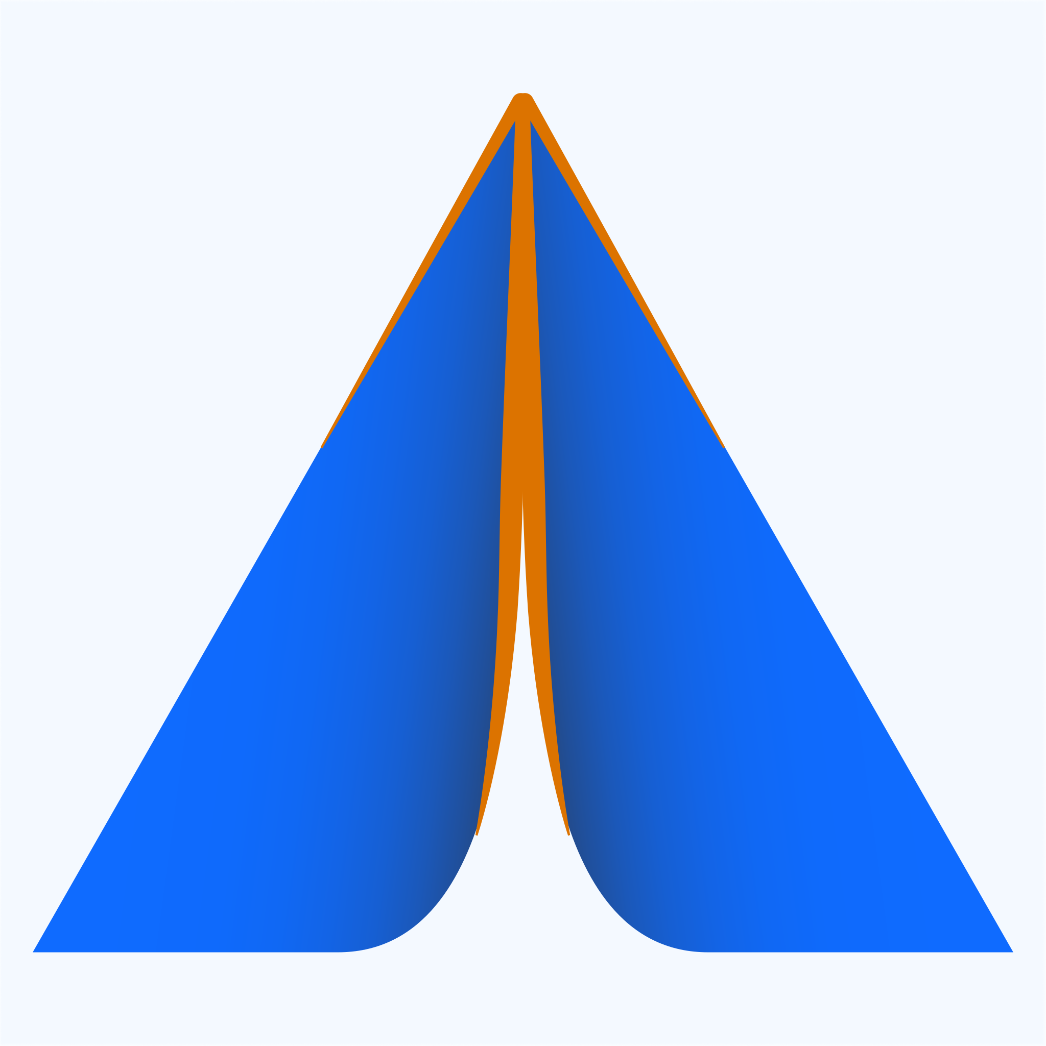
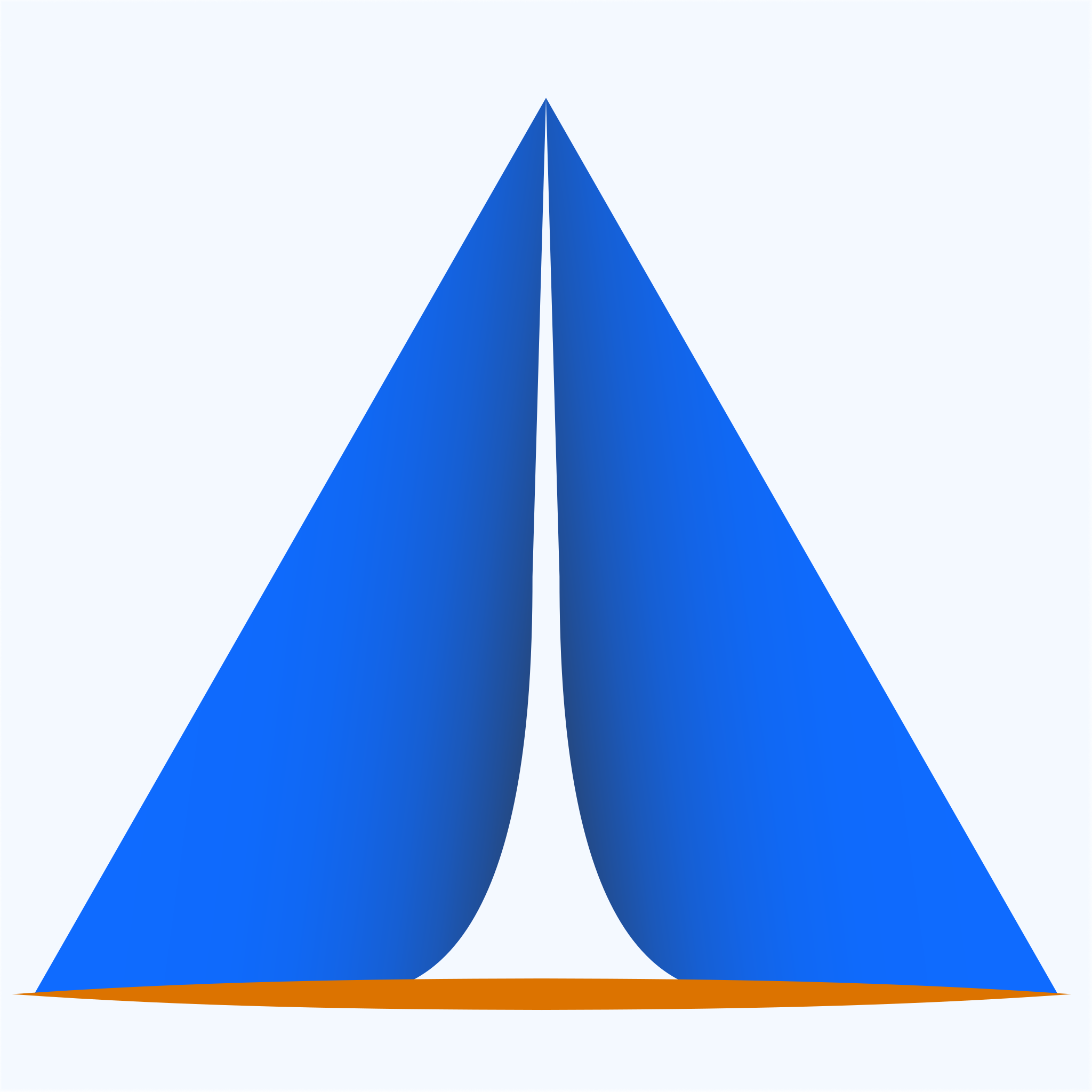
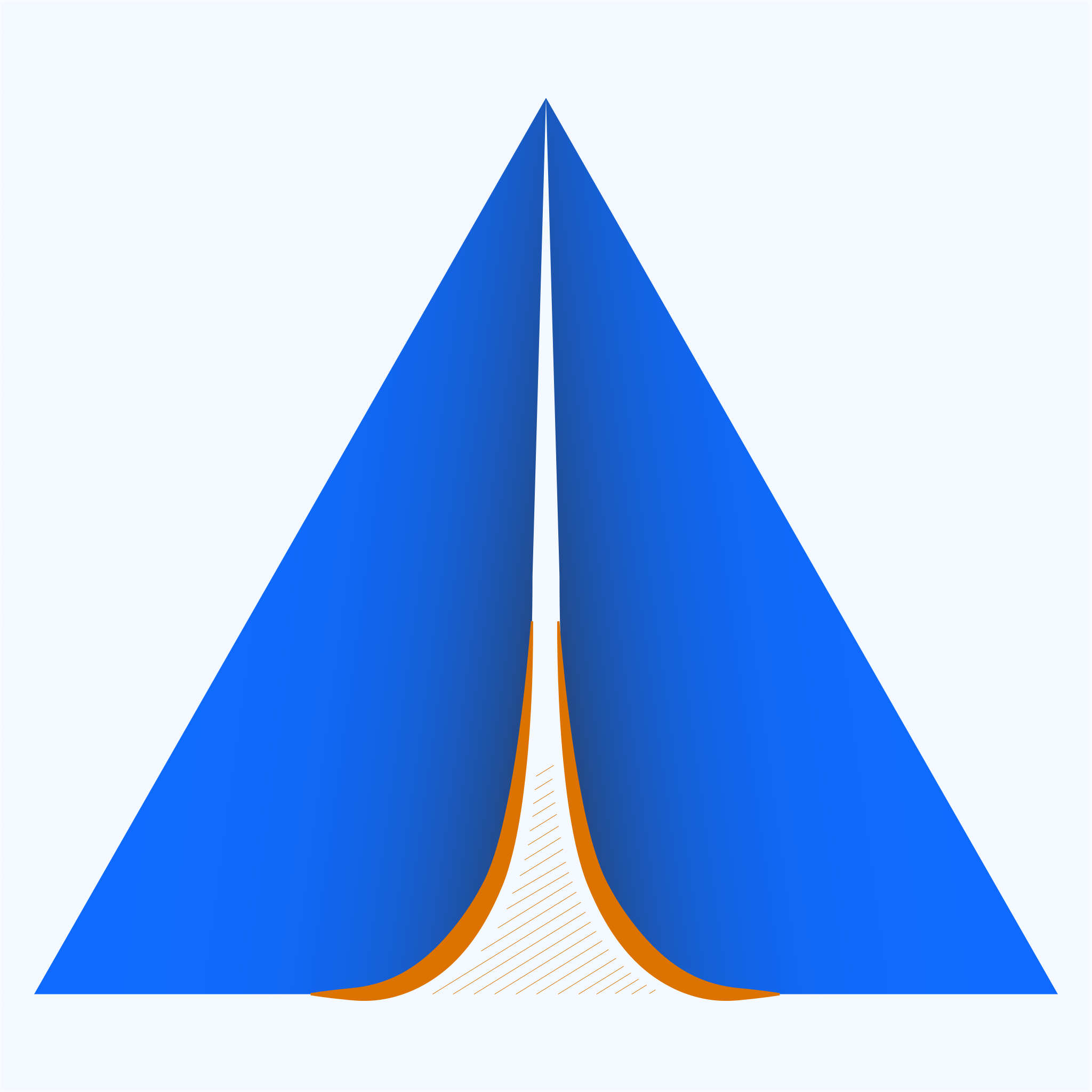
The logomark is heavy enough to stand on solid ground, and at the same time light enough to move through the cloud-space. It’s stable, yet open, ready to use and still in the making.
More than a New Symbol
Over the past months, we’ve also developed design guidelines that help ensure our communication remains recognizable. These guidelines will continue evolving alongside the foundation. You’ll start seeing the new logomark appear across our different communication channels. New presentation templates are already available, and updated merchandise is currently being prepared.
We’d Love Your Feedback!
We’re actively working on making our vision, our mission, and our role as a foundation clearer and more accessible. It’s an ongoing evolvement and, like everything else in the NeoNephos Foundation, it’s a communal European effort.
If you’d like to help shape how the foundation communicates and evolves, we’d love to have you involved. Join the conversation or share your feedback with us on Zulip, and via support@neonephos.org, and help us continue building the NeoNephos Foundation.